In today’s digital world, your headshot is the visual depiction of your brand. That image can have a global reach – so it better say what you want it to say! If you are preparing to take a virtual headshot, you know that your pose and attire can impact visual storytelling. But have you also considered color theory for headshots? Let’s dive more deeply into your target audience and the story you will tell to reach them. As you do this, we encourage you to consider color. Color theory is another dimension of branding from a visual perspective that you can communicate in your headshot. Thus, we are exploring colors and how to use them in your headshot to connect with your audience.
The History of Color Theory
World-famous artist Pablo Picasso famously stated that “colors, like features, follow the changes of the emotions.” Emotions are powerful and drive our decision-making. Therefore, as a brand, you want to cultivate a strong emotional connection with your customers. However, you can’t tell your company’s entire life story in a logo, storefront, or headshot alone. But using colors as you define your brand provides a shortcut straight to the heart of your target audience.
Faber Birren, a famous color theorist, wrote about the link between colors and emotions in Color Psychology and Color Theory. He explained how colors like red and blue create different human responses. But perhaps most interesting is that the same colors tend to provoke similar responses in different people. For example, the color yellow evokes similar feelings in people around the world.
Color theory is deeply ingrained in human evolution, developed after years of associating colors with particular objects. There are also cultural associations with color. For example, look at the way Americans associate green with money, because of our currency versus other countries. Therefore, with centuries of research and evidence, it’s not a question of whether brand colors work. Rather, it is important to know how to make brand colors work for you and your headshot.
Color Theory for Your Brand
The psychology of color can help you and your business establish trust and familiarity by eliciting the right emotions. Studies have found that a product’s color influences 60 to 80% of a customer’s purchasing decision. When you plan your headshot, explore how the psychology of colors can send the right message to your target audience. Integrate your brand’s colors across your website, your logo, and any other collateral you have. Including your headshot!
In your headshot, color will impact your wardrobe and background choice. Don’t leave any decisions to chance. Make a conscious decision when selecting your outfit and background by considering your brand and color theory. Consider that 95% of the top global brands only use one or two colors. Therefore, we can learn that consistency and simplicity are key to branding. So don’t go overboard with your outfit or background.
Emotional Responses to Colors
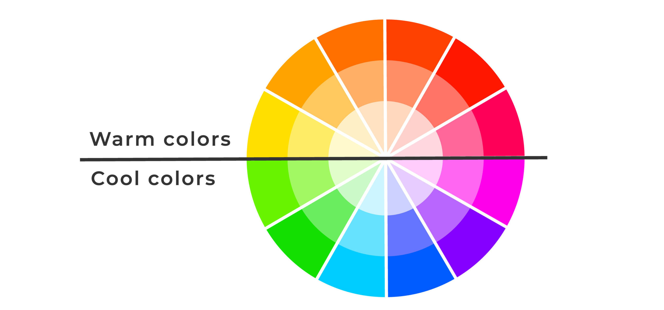
Every color elicits a different response from humans, though these responses tend to be consistent worldwide. Colors can be divided into two main categories: warm and cool. Warm colors tend to be associated with energy, while cool colors evoke calmness and security. Let’s look at color theory to help us break down key traits. You can use these in your headshots to represent you and your brand.
How Colors Make People Feel
Warm Colors
 Red evokes a passionate response. It represents excitement but also anger. It can signify importance and command attention and is sometimes seen as provocative. Red can increase your heart rate and make you breathe faster.
Key traits: aggressive, energetic, provocative, attention-grabbing, passionate.
Orange makes an ideal color choice for brands that want to combine the optimism and the brightness of yellow and the passion and the energy of red. Orange is playful friendly and energetic. It is a creative and cheerful color. (image 2)
Key traits: friendly, adventurous, playful, creative, outgoing.
Yellow evokes happiness, youth, and optimism. It can seem attention-grabbing but also affordable. It evokes feelings of positivity and hope.
Key traits: positive, youthful, warm, motivational, affordable.
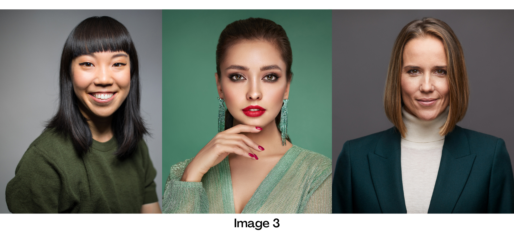
Cool Colors Green is a color that brings a sense of calmness, safety, and freshness. It tends to be associated with health, peace, and serenity. Green also evokes stability, prosperity, growth, and a connection to nature. (image 3)
 Green
Green Key traits: wealthy/expensive, healthy, serene, generous, safe.
Blue is the most popular color choice for the top global brands. It puts people at ease and is associated with trust, security, and confidence. Light blue exudes tranquility, trust, openness. Dark blue stands for professionalism, security, and formality. It is mature and trustworthy.
Key traits: trustworthy, dependable, secure, responsible, confident, calm, open.
Purple is a sophisticated yet mysterious color. It can signify royalty, creativity, and luxury.
Purple’s mysterious element is sometimes linked with spirituality, and it can bring a magical element to your branding.
Key traits: sophisticated, mysterious, spiritual.
 Brown alludes to earthly simplicity, reflecting stability and strength. It is classic and trustworthy. Brown creates a rugged, earthy, old-fashioned look or mood. (image 4)
Key traits: rugged, natural, simplistic, durable, comforting, traditional.
Black tends to be one of the most classic options. It’s both classic and sophisticated and can be combined with other colors to add a stronger emotion. Black evokes a powerful, edgy, luxurious, and modern feeling.
Key traits: luxurious, valuable, timeless, sophisticated, powerful.
White represents simplicity, purity, and cleanliness. It can evoke trust by seeming pure and simple. White brings out feelings of cleanliness, virtue, health, and simplicity. It can range from affordable to high-end.
Key traits: pure, noble, clean, soft.
How Colors Vary
When you’re looking at colors, it’s important to consider their tint, tone, and shade.
Tint refers to any hue or mixture of pure colors to which white is added. Pastel colors are generally tinted colors. A tinted color remains the same color but is paler than the original. Tone is a hue or mixture of colors to which pure gray is added (equal amounts of black and white). As a result, adding gray to a color will dull it down. Shade is a hue or mixture of pure colors to which only black is added. It contains no white or gray. Shade darkens the color, but the hue remains the same.
Creating Your Color Scheme
There’s no one right way to pick your branding color scheme. When it comes to abstract ideas like brand and identity, you want the process to be more free and open. To help create a framework for your color selection, we broke down the process into a few smaller steps.
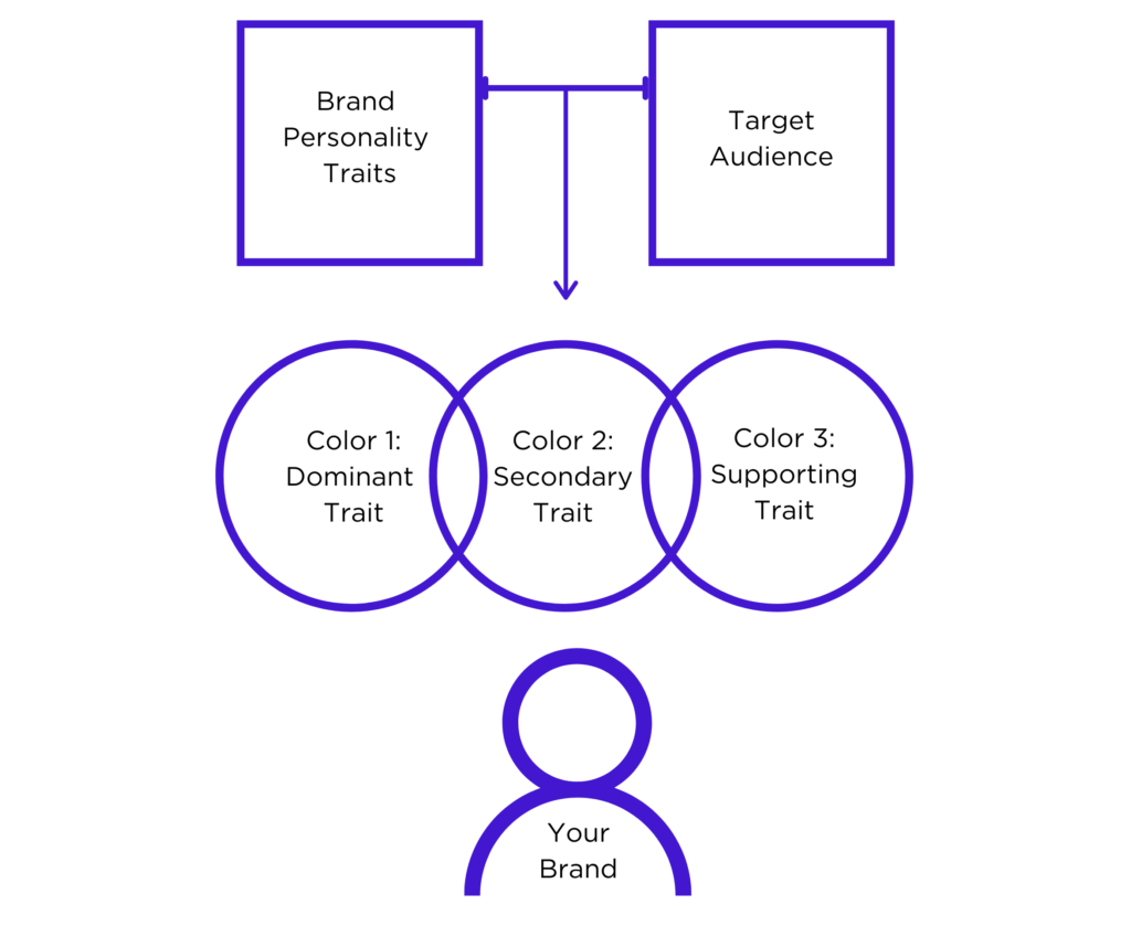
First, you will need to list your three primary brand or identity traits. You may want to make a note of your target audience to keep you on track. These three traits will help you select colors to act as your base, accent, and neutral.
Once you have narrowed your brand or identity to three key traits, you can go back to the color list. Select the colors that best evoke those traits and feelings. Start with the dominant trait and color. Next, your accent will be the color you use the most after your base color. Since this is an accent, consider how well it will pair visually with your base color. You may need to fiddle with tint and shade to get an accent color that goes with your base choice.
Last, you will select a neutral version of a color that lines up with your supporting trait. This may mean using a tone of your third trait color. Think of this as a way to round out your color scheme.
Using Color Theory for Headshots
When you understand the psychology of each color, you’ll have an easier time telling the story of your brand’s identity. Your color choice can build your headshot aesthetic while also bringing you closer to your target audience. Use the colors that will highlight your brand’s strengths, evoking the right feelings for the right audience. Do the color choices you’ve selected align with the feeling you’re trying to give to your customers? When you plan your virtual headshot with Headshots.com, we cover these steps in our guide, The 7 Qualities of a Winning Headshot.
Choosing your branding colors is easy once you know what you’re trying to communicate. However, keep in mind that a great headshot is not just a photo of you. Rather, it represents your brand and all the traits that go into it. When done right, your headshot will get you noticed and communicate honestly and instantly. A winning headshot color scheme can help get you and your business noticed and appear more interesting.
As you choose your attire and background, refer back to the colors you selected to represent you and your brand. For your photo, consider how you can contrast your wardrobe from your background in a visually pleasing way. Mix cool and warm hues. Most people have warm tones in their skin and hair. Thus, blues and other cool hues are almost always an option when it comes to contrast in your clothing choice.
Final Thoughts On Using Color Theory for Headshots
Color carries associations for the viewer. However, too many conflicting colors will render an image busy or confusing. That can sometimes make the viewer uneasy or detract from their ability to take in your expression. And the colors themselves can help you tell a story through your headshot. Therefore, give some thought to your brand traits and the associated colors. Then sign up to create your Headshots.com virtual headshot today!